
If you’re an astronomer, you’ve probably had some experience with Python and IDL. If you’re a statistician chances are you feel pretty comfortable using R. A programming language that many in academia are not familiar with is SQL, which is used for querying data. SQLite is a Python package which allows the user to conduct SQL queries in Python, making it a good introductory tool for those with experience in Python but no exposure to SQL. I showcase some of the functionality of SQLite by doing a quick data exploration from a Hubway database. Hubway is a bike-share company based in Boston. A link to this project on my Github is here.
Data Analysis with SQLite
This is a SQLite project I am working on to get used to SQLite. The data is from a bikeshare comapny called Hubway, which has information on over 1.5 million trips taken by customers in the Boston area, as well data on all of the stations in the Boston area. The data is in a database and I’ve chosen to use SQLite instead of SQL because I plan to make some plots of the data using matplotlib and seaborn in the next section. SQLite has most of the useful functionalities of SQL and I think it’s used when trying to get a quick summarizing analysis of the data within a database. A link to the database is here: In this section I’ll answer a number of questions including:
- What type of customers tke the longest trips?
- How long do most trips last?
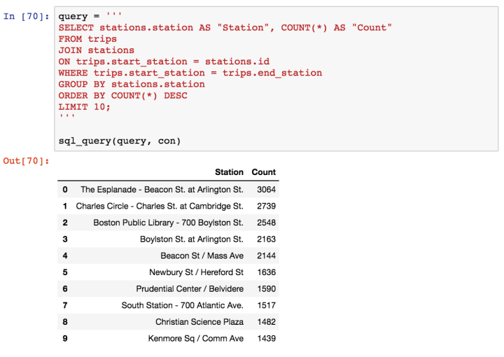
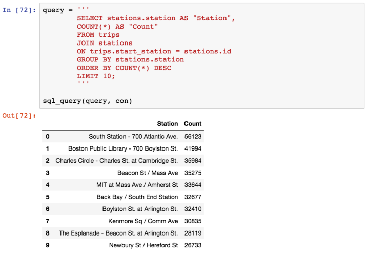
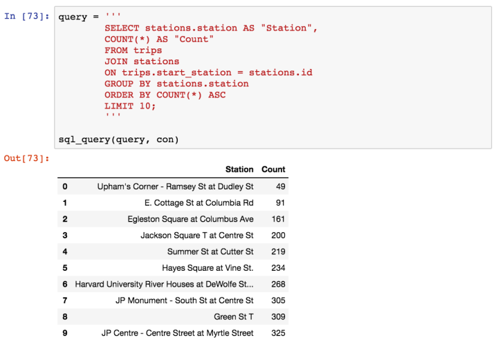
- Which stations receive trips the most frequently?
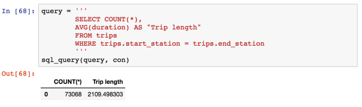
- Do customers return to the same station they started at often?
The first thing we’d like to do is import SQLite:

Now we can connect to the SQL database:

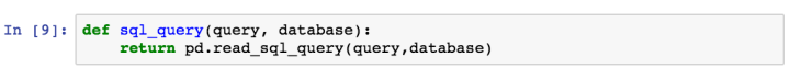
This gives us access to Hubway’s database, but we need to figure out the parameters that are in it. We can make a fucntion that will output any type of query:
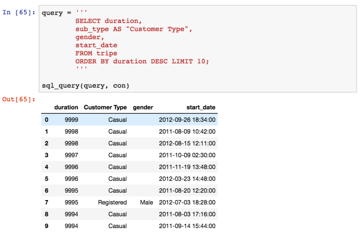
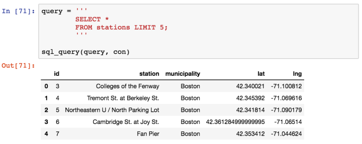
 With this it is possible to run any query in a manner very similar to how it would be done in SQL. We can take a look at the first five rows of data from the table ‘trips’ as an example:
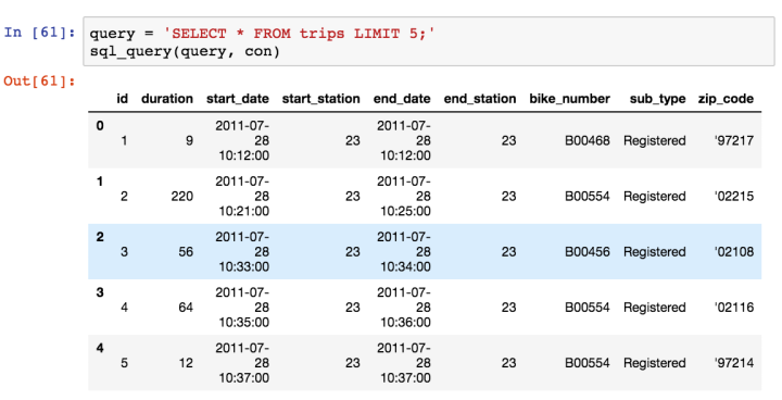
Looking at these rows of data, we can automatically see that there at least two distinct values for every column (e.g ‘end_station’ is 23 and 40) except for sub_type. We can check the total number of different types of sub_types using the query below:
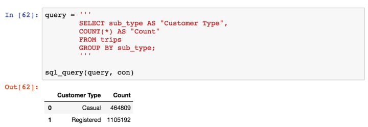
So customers are either described as Registered or not. Most of the trips seem to be had by registered riders, but let’s take a look at how long these rides last:
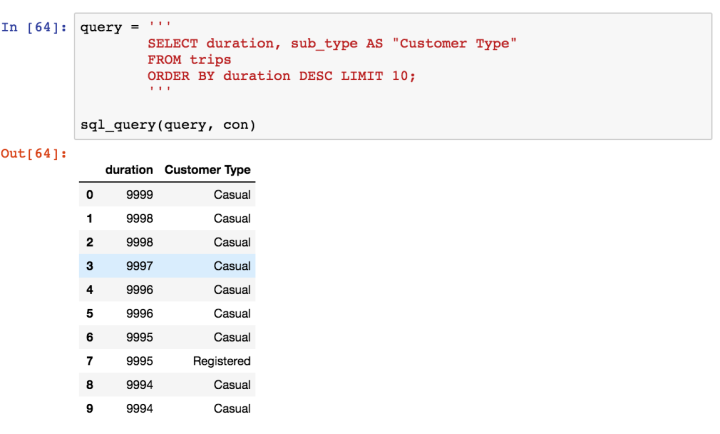
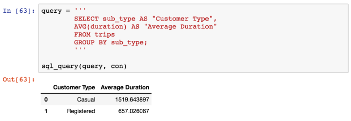 We’re starting to unveil a story here. The bulk of rides are taken by registered customers but rides by casual customers tend to be considerably longer. Let’s look at the type of customers who had the ten longest ride times:
Summary
So far we’ve learned a lot about the customers of Hubway, mainly that:
- Most customers are registered members
- 76% of registered customers are male
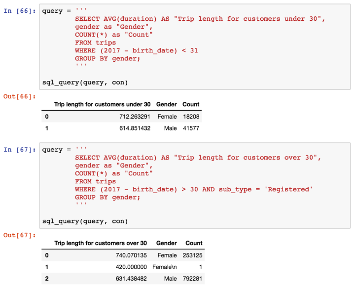
- Registered female customers rent bikes for 1 minute longer than males do
- Casual customers take trips that last more than twice as long as registered customers
- Customers over the age of thirty take trips which are ~ 40% longer than customers under thirty
- Certain staions (South Station, Boston Public Library) are strongly preferred over others (Upham’s Corner)
- There may be a correlation between sub_type and the time of year a customer rents a bike.
Moving forward there are a lot more questions we can ask using this data including:
- What time of the year do bike rentals rise?
- How much more are stations in densley packed areas frequented than those in sparsley packed areas, and during what time of the day, week, year is the disparity the largest?
- Can we predict if a customer will become a member based on where and when they rent bikes?
These are questions which, in my opinion can be better answered and visualized using pandas, matplotlib, seaborn and scikit-learn. I will answer these questions and more in the next section!
